paintingfor the painting i was able to extract the themes of
-light play through reflection and filtering
-revealing ones self through exposure
-use of contrast to draw attention
narrativeand it was with these themes i was able to extract the narrative of
".. a proud exhibitionist area of theatre, lit by deep contrast"
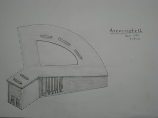
designand then it was form this narrative that i could start designing
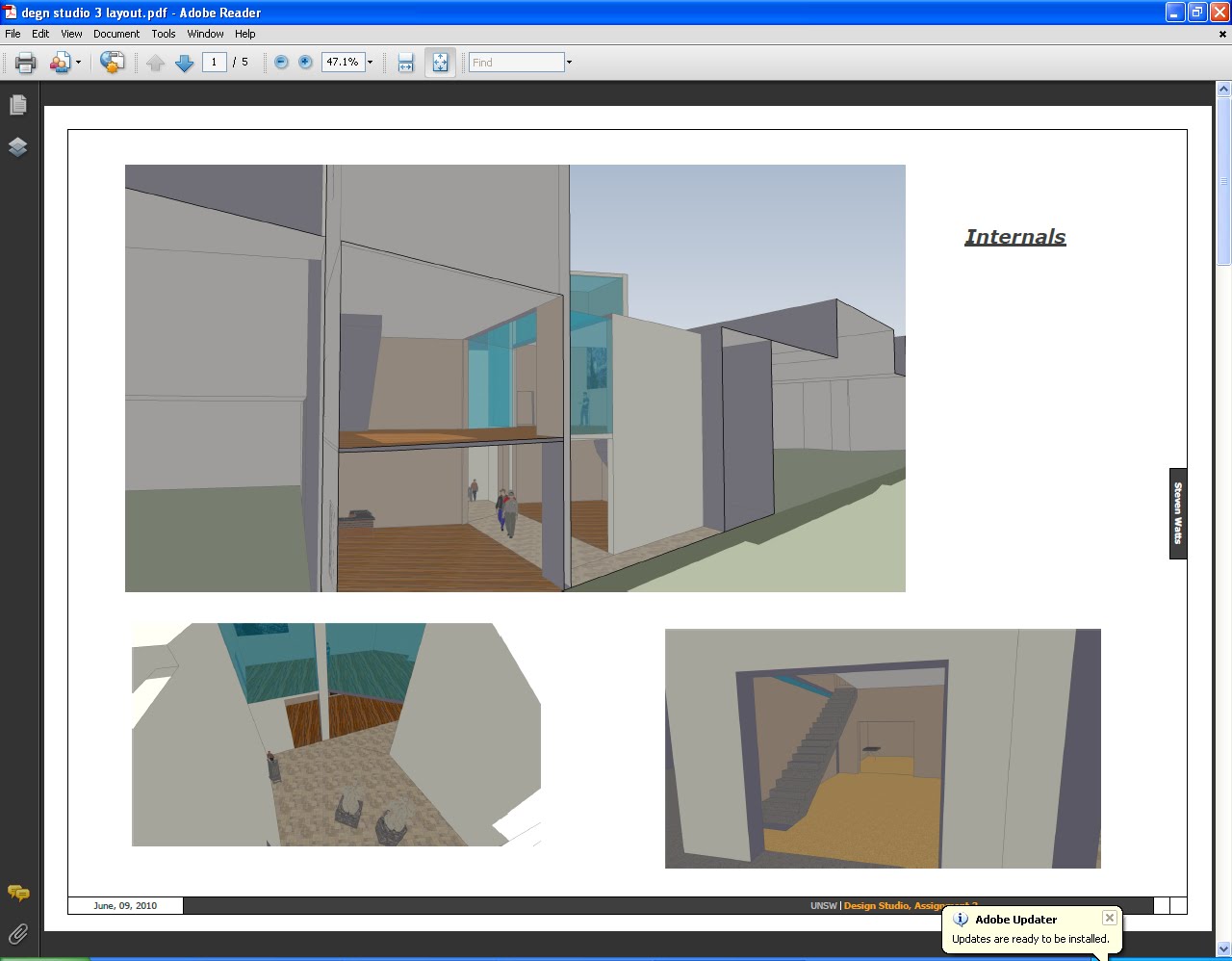
firstly i needed to make an area of theatre, so after trial and error i went for a classical amphitheatre setup. since it was the theatre of an exhibitionist i wanted to remove any thing hidden such as back stage of even curtains. as a result the public enter form a behind the stage to see a silhouette burning into the translucent wash behind the stage.
this incorporates the idea of light play. with the seemingly random slats on the side of the building it is impossible to see the whole show instead the public are teased by flickers of internal light escaping form the theatre. this light play turns the building in to a dynamic space which encourages movement and curiosity ultimately encouraging you to enter.
my choice of materials were black card, white card and translucent paper with these i was able to use the idea of contract to tame the eye and draw it to the center of the stage.


 i have chosen this location in the heart of Sydney because of its sloping topography which matches the natural amphitheatre of the structure.the natural slope also allows the rear of the structure to face the north. This will cause the northern sun to penetrate through the skylights and light the stage. the location is also ideal as it has a large pedestrian flow, this will allow the public to interact with the theatre as well as inviting the public to satisfy their curiosity.
  i choose this Edward hopper painting because of its use of contrast to highlight and draw attention to the occupants. i also enjoy the interplay between the black and white as the fight for dominance in the scene with the internal light spreading into darkness.


